Toronto Traffic Collision – Kaggle

Overview

This project is part of a Kaggle Competition where we developed several machine learning models to predict the severity of traffic collisions.

Problem Statement

This dataset includes all traffic collisions events where a person was either Killed or Seriously Injured (KSI) from 2006 – 2022.

This Killed or Seriously Injured (KSI) dataset is a subset from all traffic collision events.
The source of the data comes from police reports where an officer attended an event related to a traffic collision. Please note that this dataset does not include all traffic collision events. The KSI data only includes events where a person sustained a major or fatal injury in a traffic collision event.

You need to build a Binary classification model based on certain features would predict if the incident would result in fatality or not.

To know more about the competition please click the below button

Data Exploration

The train dataset contains 53 features including the target feature – ACCLASS, while the test dataset contains 52 features excluding the ACCLASS

The dataset contains many missing values, so we analyzed each column.

While we were analyzing the features we learnt a lot

Street1 and Street2

After plotting bar plots for count of events that have occurred in street 1 and street 2 we plotted the count of events that have happened at their intersection.

We do this so that we can reduce the number of features, this will help and improve the results of our machine learning models.

So we create a column that is the concatenation of street1 and street 2 and then drop the columns street1, street2.

ROADCLASS

According to the City of Toronto Road Classification, all roads are classified as:

  • expressway
  • major arterial road
  • minor arterial road
  • collector road
  • local road
  • laneways

To find where the most fatal accidents have occured we have used crosstab to show the relationship between ACCLASS and ROADCLASS.

Most Fatal Accidents have occured on Laneways

This analysis shows us that Toronto must focus its resources and traffic control in laneways more than other roads.

distribution of ACCLASS and ROADCLASS

DISTRICT

District contradicts insights we learnt from STREET1+STREET2, so it is being dropped as its more useful to know the exact location of a accident compared to just knowing the district.

Before that we visualize DISTRICT by creating a Count plot using seaborn library

Similarly we analyze each columns and drop the unnecessary features. This results in a total of 27 features in our train set and 26 features in our test set

Data Processing

The target feature – ACCLASS is label encoded with Fatal: 1,. and Non Fatal: 2

A pipeline is created to preprocess the numerical and categorical features. Simple Imputer with Standard Scaler is used on the numerical features, while Simple Imputer with the One Hot Encoder is used on the categorical features.

Using Column Transformer a preprocessor is created to combine both the preprocessing steps.

A stratified split is used with the test size of 25%. 

Prediction Probabilities - Random Forest, KNN, and Logistic Regression

Four different classification models are trained—Random Forest, K-Nearest Neighbors (KNN), Logistic Regression, and Gaussian Naïve Bayes—on a dataset of traffic collision data. Each model is trained using transformed training data (`X_train_transformed, y_train`) and then evaluated using cross-validation (`cv=4`). The evaluation involves predicting class probabilities for each instance, extracting the probability of the positive class, and storing it for further analysis. The models are built using `sklearn` libraries, with `predict_proba` used to obtain confidence scores for predictions.

ROC Curve

An ROC curve (receiver operating characteristic curve) is a graph showing the performance of a classification model at all classification thresholds. This curve plots two parameters:

  • True Positive Rate
  • False Positive Rate

An ROC curve plots TPR vs. FPR at different classification thresholds. Lowering the classification threshold classifies more items as positive, thus increasing both False Positives and True Positives. The following figure shows a typical ROC curve.

  • AUC stands for “Area under the ROC Curve.” That is, AUC measures the entire two-dimensional area underneath the entire ROC curve
  • AUC provides an aggregate measure of performance across all possible classification thresholds. One way of interpreting AUC is as the probability that the model ranks a random positive example more highly than a random negative example

AUC is desirable for the following two reasons:

  • AUC is scale-invariant. It measures how well predictions are ranked, rather than their absolute values.
  • AUC is classification-threshold-invariant. It measures the quality of the model’s predictions irrespective of what classification threshold is chosen.

This ROC (Receiver Operating Characteristic) curve evaluates the performance of four classification models—Random Forest, K-Neighbors, Logistic Regression, and Gaussian Naïve Bayes—by plotting the True Positive Rate (TPR) vs. False Positive Rate (FPR) at various classification thresholds.

The Random Forest model is the best performer in this case, followed by Logistic Regression. K-Neighbors and Gaussian NB are less effective for this dataset.

From the image we can see that the AUC for Random Forest is the closest to 1. So Random Forest is performing the best among all our models.

Confusion Matrix for Random Forest Classifier

  • True Positives (TP) = 816 (Correctly predicted as 1)
  • True Negatives (TN) = 9723 (Correctly predicted as 0)
  • False Positives (FP) = 10 (Incorrectly predicted as 1)
  • False Negatives (FN) = 701 (Incorrectly predicted as 0)

Our model correctly identifies a large number of Non-Fatal Injuries, but needs improvement for prediction of Fatal Injuries

  • Precision = TP/(TP+FP) = 824/(830) = 0.9927
  • Recall = TP/(TP+FN) = 824/1517 = 0.543

Recall of 0.54 is not good, lets try to increase the recall.

Similarly we observe the confusion matrix for the rest of the models.

Precision and Recall Curve for Random Forest Classifier

The recall for the random forest classifier is quiet lot, thus we need to calibrate the threshold to change the threshold we consider changing the probabilities generated from the method predict_proba

Now with the new threshold we run Grid Search CV on the Random Forest Model.

The confusion matrix after the model runs again with Grid Search CV is

  • True Positives (TP) = 439 (Correctly predicted as 1)
  • True Negatives (TN) = 2227 (Correctly predicted as 0)
  • False Positives (FP) = 1018 (Incorrectly predicted as 1)
  • False Negatives (FN) = 66 (Incorrectly predicted as 0)

Our model has achieved an accuracy of 71.09%.

The recall has successfully gone up from 0.54 to 0.87

Our model is performing better now.

Testing our Model in Kaggle

After several tries we achieved a accuracy of 90.39% on our test dataset.

This resulted in us coming Rank 4 among 10 teams on Kaggle

Result

This Kaggle competition was a challenging exercise that taught me many important machine learning concepts. 

In less than a month I cleaned the large dataset of 50k records and successfully created several machine learning models achieving a final accuracy of 90.39%

Description

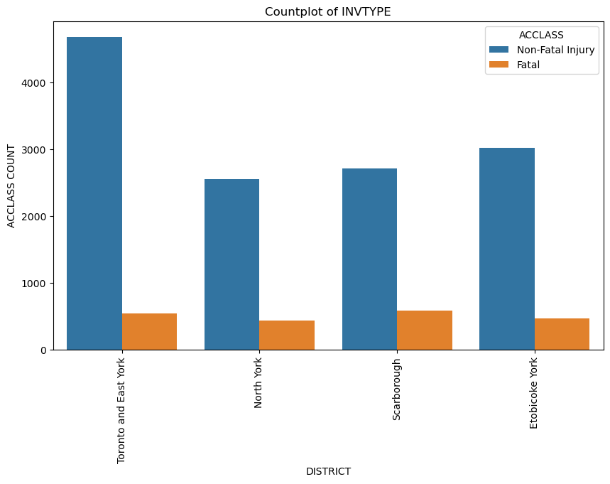
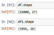
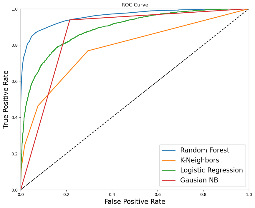
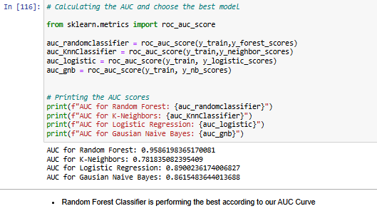
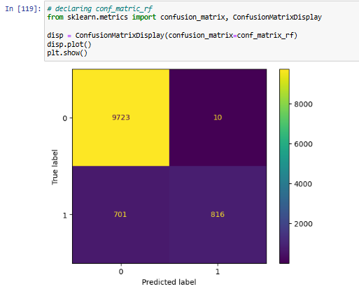
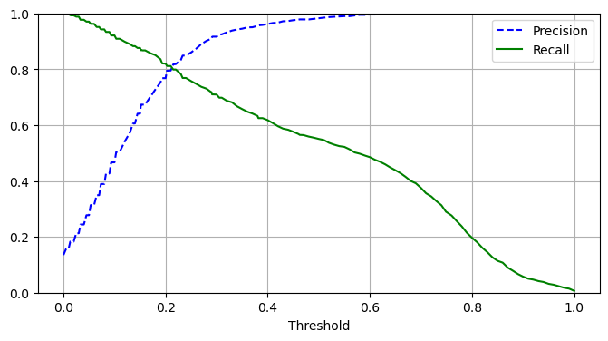
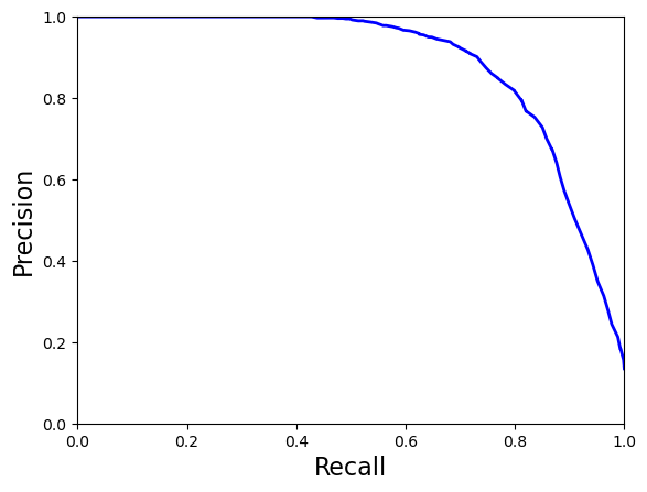
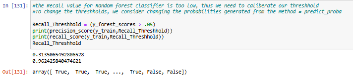
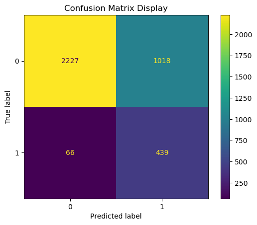
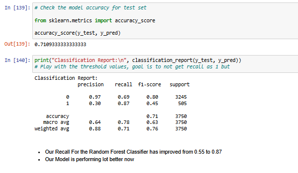
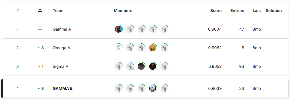
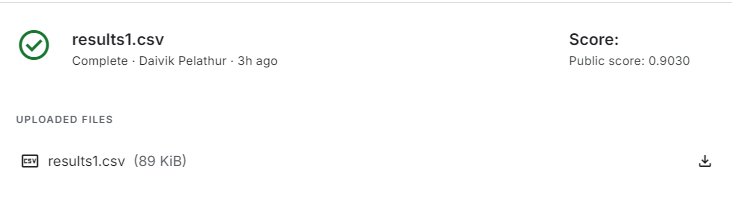
This project focuses on predicting the severity of traffic collisions using machine learning techniques. Based on a dataset of police-reported collisions from 2006-2022, we built and optimized models to classify accidents as fatal or non-fatal. By leveraging Random Forest Classifier, feature engineering, and Grid Search CV, we achieved 90.39% accuracy and secured 4th place in the Kaggle competition.