

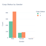
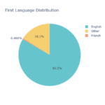
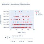
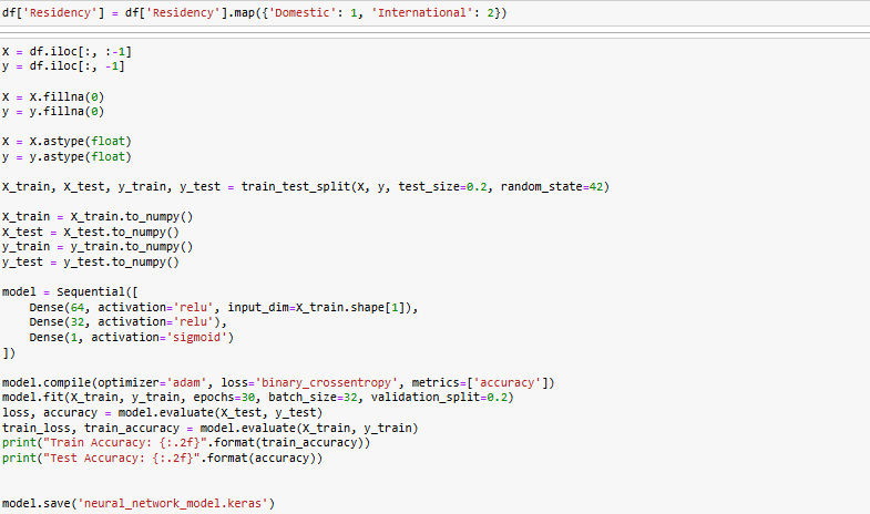
Student Data Visualization
Description
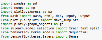
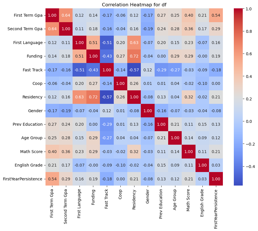
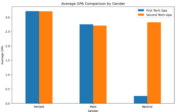
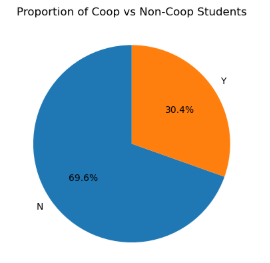
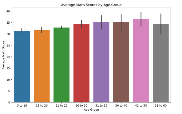
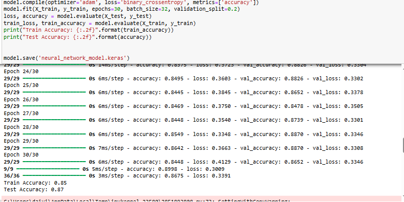
This project leverages Artificial Neural Networks (ANN) and interactive data visualizations to analyze student data and predict first-year persistence. The solution integrates: