This project analyzes global population trends using Excel and Power BI, creating interactive dashboards and visualizations. The analysis highlights regional growth patterns, population density challenges, and long-term demographic shifts
Data Exploration
MS Excel
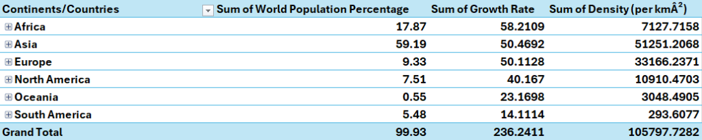
The project began with exploring the data using Excel. I created several Pivot tables to analyze the dataset.
Some key takeaways:
Asia and Europe dominate in terms of population density.
Africa, Asia and Europe have the highest growth rate.
Asia holds the largest portion of the world population percentage at 59.19%
Power BI
The visualization in this project was done using Power BI, which was used to create interactive dashboards and reports. Power BI enabled the analysis of the world population dataset.
Missing Values Analysis
The dataset was inspected for any missing or null values using Power Query, No significant data quality issues were found
Duplicating and Unpivoting the dataset
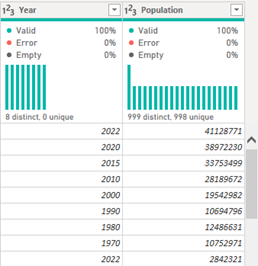
First, the original world population was duplicated in the power query, and then the population columns for 1970 to 2022 were unpivoted, creating two new columns: ‘Year’ and ‘Population.’ This step transformed the data into a more analysis-friendly structure for visualizations by year.
Furthermore the newly created columns were renamed ‘Year’ and ‘Population’ for clarity and consistency in the dataset.
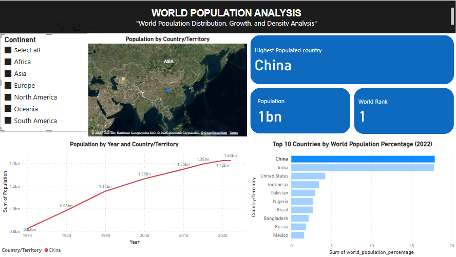
Dashboard1 - World Population Analysis
Page 1 of our world population analysis report answers the following questions
Which country has the highest population? What is the population and World Ranking of this country?
What are the top 10 countries by World Population Percentage?
How does the Population grow over the years in countries and continents?
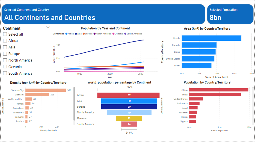
In Dashboard 1 we created the following visualizations, with filters and a slicer.
A Line Chart was created to visualize the population growth trends by year across different countries/territories. The chart helped illustrate how populations evolved over time.
The column chart helps to highlight the top 10 countries by world population percentage.
The aerial map shows the population on the globe, the size of the bubbles indicates the population
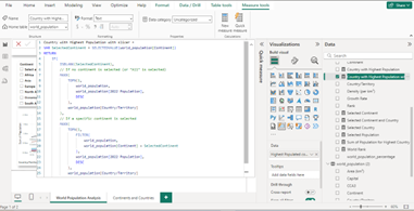
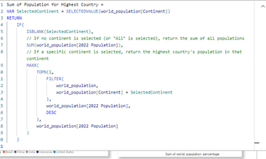
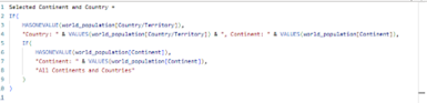
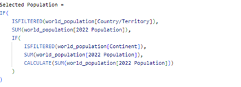
Custom DAX measures were created to dynamically display the country with the highest population, population value, and rank based on a selected continent or country.
Dashboard 2 - World Population Analysis
In Dashboard 2 we created the following visualizations, with filters and a slicer.
A Line Chart was created to visualize the population growth trends by year across different countries/territories. The chart helped illustrate how populations evolved over time.
A Funnel Chart was created to visualize the world population percentage contributed by each continent.
The slicer allowed to filter by continent.
A column chart displayed the total area (km2) by country/territory
Measures were created to customize the cards
Result
The analysis offered a detailed and comprehensive view of global population trends, highlighting the varying growth rates, densities, and population distributions across continents and countries. Using Excel for data analysis and Power BI for visualization, the project provided valuable insights into how different regions contribute to the world’s population landscape. Power BI’s dynamic and interactive visualizations allowed for an in-depth exploration of population patterns, enabling users to easily track population growth over time, compare regions, and understand critical metrics such as world population percentage and density. The combination of these tools effectively illustrated the scale and pace of global demographic changes, offering a robust platform for future population studies and decision-making.
Description
The World Population Analysis project leverages Power BI to explore global population trends from 1970 to 2022 through interactive dashboards. It features dynamic charts, maps, and demographic insights, enabling users to analyze population growth across countries and regions. DAX measures provide real-time calculations for trends, helping uncover patterns in birth rates, urbanization, and density changes. The dashboard allows users to filter data by year, country, and population growth factors, offering a comprehensive, data-driven view of global demographics. This project demonstrates data visualization, report design, and analytical capabilities, making complex trends accessible through clear, interactive insights.